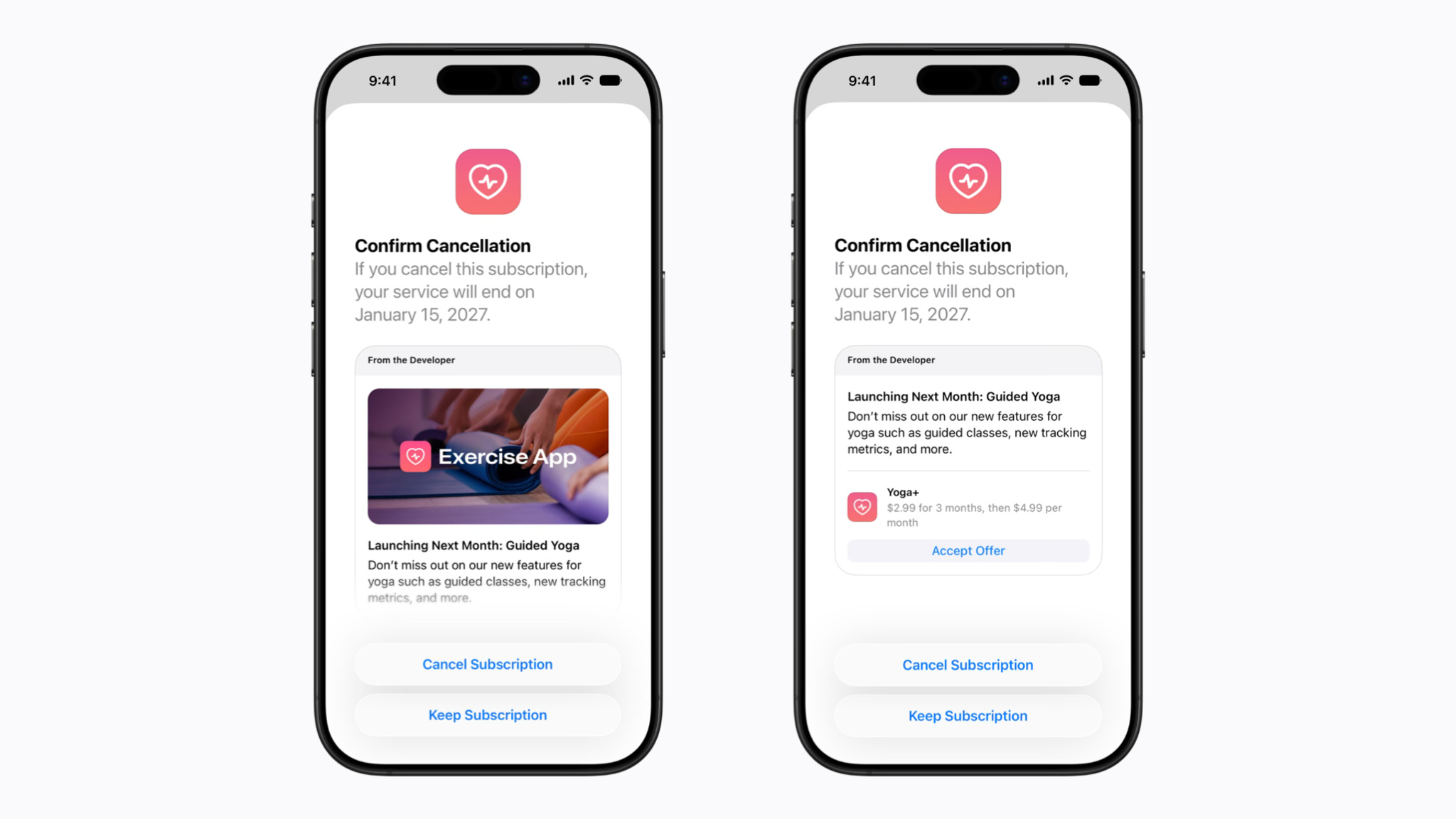
Apple's November 4 developer announcement makes retention messages available for auto-renewable subscriptions. The messages appear in the cancellation flow and can include text, an image or an eligible offer. Developers can configure them in App Store Connect; individualized selection through the Retention Messaging API requires requested access. This gives developers another opportunity to explain their service when a subscriber considers leaving. It also creates a demanding design moment: the person arrived to make a decision about an existing commitment. Our judgment is that any attempt to retain that person should make the alternatives easier to understand. The screen should help distinguish continued value from a temporary reduction in cost.
An offer has a different job from general copy
Apple's setup documentation says eligible subscribers see an associated offer instead of the message's optional image. People without an eligible offer can see the image and general text. That shared text cannot mention specific promotional offers, discounts or prices, because ineligible subscribers see it too. The documentation also supports localization and previews of eligibility states. These distinctions make the general explanation and the offer different components with different audiences. A sentence that is accurate only for the discounted group would be a poor explanation for everyone else. The complete flow therefore needs to be assessed across its states, rather than approved from the most attractive example.
NEXTECH analysis: respect the reason for leaving
Begin with the reason a person might leave. Someone who no longer uses a service faces a different decision from someone who values it but cannot justify the current price. A generic list of features may describe the subscription accurately while failing to address either situation. We would favor concise information about the service a person retains and the consequence of cancelling, without claiming to know that person's motivation. Personalization should also have a practical limit: it should not invent a reason the subscriber ought to stay. A relevant explanation can support a voluntary decision; an elaborate screen that obscures the available choices would undermine that purpose.
Explain the next charge as well as today's offer
The offer itself needs a time horizon. A reduced initial charge tells a subscriber little about the commitment after the reduced period ends. Our proposed assessment would examine whether the flow as a whole makes the offer amount, duration and subsequent renewal terms understandable before acceptance. This is a criterion for evaluating the experience, not a claim that developers can customize every part of Apple's interface. A useful worked example would let a reviewer explain what happens at the next two billing points in ordinary language. If that explanation requires guessing, the attractive headline amount has left part of the decision unresolved.
Evaluate eligible and ineligible paths separately
Eligibility introduces another possible source of confusion. An eligible person might see a specific alternative, while someone else receives only the general explanation. Both paths should remain coherent on their own. We would inspect whether each person can identify what is actually being offered and which action changes the subscription. For the path without an offer, we would look for wording that accidentally implies a discount remains available elsewhere. For the discounted path, we would check that accepting the offer does not depend on interpreting a vague confirmation. These are proposed review questions. We have not examined an implemented app flow or observed subscribers using one.
Keep cancellation a complete, understandable action
The cancellation path deserves the same scrutiny as the retention path. A person should be able to understand which action continues cancelling, which action keeps the current subscription and which action accepts a different offer. Those are distinct choices. Their labels should describe the consequence clearly enough that a subscriber can predict what follows. We would also inspect the confirmation state, since a person needs to know whether cancellation succeeded or whether the subscription remains active. This editorial standard concerns the entire journey. A persuasive message is only one part of it, and an evaluation confined to that message would miss the outcome the subscriber came to achieve.
Proposed checks for accessibility and localization
Accessibility and localization require concrete checks rather than a broad claim that the design is simple. A proposed review would examine reading order, control labels and focus behavior with assistive technology, alongside larger text and smaller screens. The aim would be to establish whether the terms and actions remain understandable through those routes. A localized version would need the same examination with its own wording, number formatting and text length. An English preview cannot establish the clarity of another language. These checks would need to include both eligibility states and the final confirmation. We are describing a review plan, not reporting an accessibility audit or certification.
Measure understanding alongside the decision to stay
A developer can count how often people stop cancelling, but that count alone would leave the quality of the decision unknown. We would assess comprehension separately: can a person explain what they accepted, when the offer ends and how the subscription continues afterward? A proposed study could ask those questions after a clearly defined task, then compare the answers with the terms shown. Completion time and errors could help identify confusing steps, provided faster completion is not treated as proof of understanding. The evaluation would need to disclose its participant selection and task conditions. We have collected no such results, and make no numerical claim about retention messages.
Assess the next renewal, with appropriate limits
The next renewal would add another perspective. Continued use, a correctly understood charge and a later decision to leave represent different outcomes from an immediate reversal of cancellation. A developer evaluating its own implementation could examine those outcomes alongside the initial acceptance rate, with appropriate care for the information collected. It would still need a defensible comparison before attributing any business change to the message. Changes in price, service quality or the audience could also affect the result. Our argument is that a saved subscription should remain an incomplete measure until the subsequent experience is considered, rather than becoming a self-contained claim of user benefit.
What this announcement leaves for individual apps
The announcement establishes a tool and its documented configuration options. It does not establish how individual apps will explain their offers, which subscribers will qualify or whether a particular implementation improves understanding. NEXTECH has not tested a live cancellation journey, measured subscriber behavior or assessed a developer's commercial results. The strongest judgment available now concerns the design standard: an alternative should be specific, the subsequent commitment should be understandable, and completing cancellation should remain a clear choice. Those conditions give future examples something meaningful to demonstrate. They also let readers evaluate a retention message as part of a subscription decision, rather than as evidence that staying is automatically the better outcome.
- Apple Developer: Retention messages for subscriptions ↗Published 2026-11-04
- App Store Connect Help: Configure retention messages ↗
Source check: 2026-11-05. Reported facts link to primary sources; editorial interpretation is identified in the article.